Brochures can be one of the most effective tools in your marketing suite.
As part of your business identity a well-designed, effective company brochure attracts attention, details what it is your business does and what it can do for your customers whilst motivating the target audience to take action.
1. Purpose
What is the purpose of the brochure? Is it a sales tool? Do you want to create more awareness of your brand? Start by thinking what are the main objectives in wanting a brochure and what do you want it to achieve.
- What is the purpose of the brochure?
- Who is the target audience?
- What is the main message of the brochure?
- Where will it be used?
- Audience reaction – what response do you want from your audience?
- Personality – what image do you want to project to the target audience?
2. Define the elements
List out the main elements you wish to communicate in the brochure. By focusing on what is needed on each page you will help define the concepts and the page count of the document.
3. Format
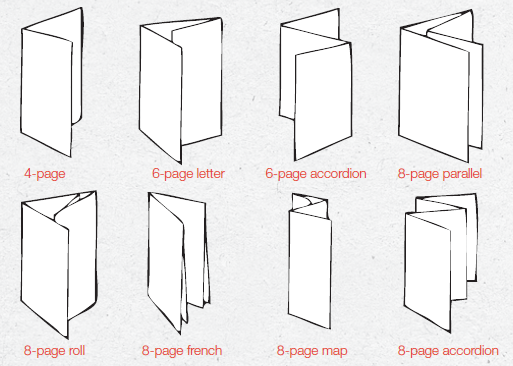
Finding the right format is a key step in creating a brochure. Whether this is a tri-fold flyer or a high-end brochure selling luxury products. The format must fit the appropriate needs of the brief. Some examples of different folds and formats are below.

4. Valuable content
Content needs to be written with the reader in mind. Keep jargon and buzz words to a minimum keeping the message clear and concise. Include clear call to actions and contact details. Great content increases the comprehension of your concept. Valuable content should contain the answers to issues and questions your readers may have.
5. Fonts
When designing a brochure simple font solutions are always best. Keeping fonts to a minimum keeps the design clean and easy to navigate. You will need a headline font, sub head and body copy font.
6. Imagery
You will need a bank of good images to choose from when creating a brochure. If the budget does not extend to a photo shoot then access to a good stock photo library is key. Quality images are essential when creating a brochure. Images will need to be of a high resolution. There are various types of visual elements used in brochures from photographs to hand drawn illustrations and graphical icons.
7. Colour
It is important that the colour palette matches scope and purpose of company.
8. White space
White space is good. It makes the brochure feel clean and approachable. Most clients want to get value for their money when hiring a design agency to design their brochure. In the past white space was seen as wasting that money. Unfortunately a brochure which is crammed with text and images ends up confusing the reader and therefore reduces its overall effectiveness.
White space is a great background to make elements stand out. Rather than compete for your customers attention let the white space work with your brochure rather than against it.
9. Paper
The right paper stock helps create the right impression. Using a heavier paper has the potential to convince a customer that you are more professional than your competitors.
Things to consider when choosing paper stock:
Weight
The thickness of the paper is referred to as paper density and is measured in GSM (grams per square metre). The larger the GSM the thicker the paper. The examples below detail different paper weights and their usages.
80 – 100gsm: Office paper
110 – 120gsm: Stationary, letterhead and comp slips
130 – 170gsm: Brochure pages, leaflets, flyers and posters
170 – 200gsm: Brochure covers
200 – 250gsm: Brochure covers
300 – 400gsm: Business cards
400gsm and above: Business cards
Paper types
Coated papers have a smooth surface finish which aid colour and photo reproduction
– Gloss: shiny
– Silk: smooth with velvety feel
– Matt: without shine
Uncoated papers are porous which absorbs ink into their fibres resulting in a much softer image reproduction;
– Laid paper: textured surface to the paper
10. Proofing
Proofing your brochure is a vital part of the process. Check for spelling errors and any rogue spaces that may have snuck into the document. Proofing a brochure for print is especially important as once it is printed the mistake is indelibly there for all to see.
It is a good idea to ask someone who hasn’t seen the brochure to proof read as a fresh set of eyes is more likely to pick up on any mistakes.
11. Printing
Not all printers are the same so choosing the right fit is important.
Digital printing versus Litho – How to make the right choice?
It is not always east to decide which printing process will best suit your job. Below is a breakdown helping to aid the decision making process.
Litho Printing;
Traditional offset litho printing is when an image is burned onto a metal plate, then transferred (offset) from the plate onto a rubber blanket before being printed onto the paper.
| PROS | CONS |
| High quality | Expensive on short runs |
| Prints extremely well on a large range of surfaces | Longer turnaround times due to labour intense set-up |
| Can print special inks, Pantone spots and metallics | |
| Cost effective on large runs without losing quality |
Digital Printing;
Digital printing reproduces the effect of full colour printing but removes many of the expensive steps used in conventional offset printing, including making the plates.
| PROS | CONS |
| Quick set-up time leading to fast turnaround | Expensive on longer runs |
| Bright, vibrant images on a range of materials | Less colour control |
| Cheaper option for low volume printing | Nor suitable for all printed surfaces |
| Cannot accurately reproduce pantone colours – uses a 4 colour matching process |


